Pharmacist
“I validate every number before it reaches the patient.”
Needs: the calculation basis, adjustments and rounding visible in one place.
Cerner · Pharmacy Medication Manager
Transforming a complex clinical calculation into a clear, confidence-inspiring workflow — without removing the clinical depth behind it.
Business goal
Improve usability · address customer complaints
My role
Design leader · concept to finish
Design shift
Dense calculation → clear clinical hierarchy
Evidence
Usability score 6.3 → 8.9
01 · Business problem
The Dosage Calculator held the right clinical information, but without clear hierarchy. Important values competed for attention, and customer complaints made the need for a fundamental improvement clear.
02 · Who it serves
Pharmacist
“I validate every number before it reaches the patient.”
Needs: the calculation basis, adjustments and rounding visible in one place.
Oncologist
“Small errors in BSA-based doses carry big consequences.”
Needs: patient parameters and dosing weight clearly tied to the final dose.
Nurse
“At the bedside I need to confirm, not decode.”
Needs: a final dose that is unmistakable, with the reasoning one glance away.
03 · Design challenge
Clinicians move through medication, patient parameters (weight, height, BSA), calculation basis, calculated dose, adjustments and rounding before applying a dose. Each step needed to be understood — not just the final number.
Goal
Better usability · fewer complaints
Friction
Information overload · weak hierarchy
Design
Structure that follows clinical reasoning
Outcome
Usability score 6.3 → 8.9
04 · Key decisions
01
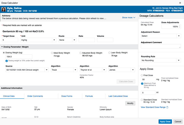
Keep every clinical input, but group it into patient context, dosing parameters and additional information.
02
Give target dose, calculated dose and final dose a clear visual distinction from supporting data.
03
One coherent flow from calculate to apply, with adjustments, rounding and reasons beside the result.
05 · Ambiguity to clarity
Friction
Clinical depth versus simplicity — every field felt essential to someone.
How I navigated it
Grouped information by the order clinicians actually reason: patient, parameters, calculation, final dose.
Clarity
Nothing clinical removed; far less competing for attention.
Friction
A visual refresh was expected; customer complaints pointed to deeper workflow issues.
How I navigated it
Reframed the work as an experience redesign, grounded in complaint themes and usability findings.
Clarity
Agreement to rethink hierarchy and flow, not just styling.
Friction
Design ambition versus engineering and legacy constraints.
How I navigated it
Reviewed solutions with product and engineering early and kept patterns consistent with the platform.
Clarity
A redesign the team could build and ship.
06 · Product evidence
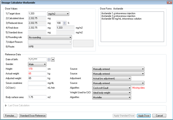
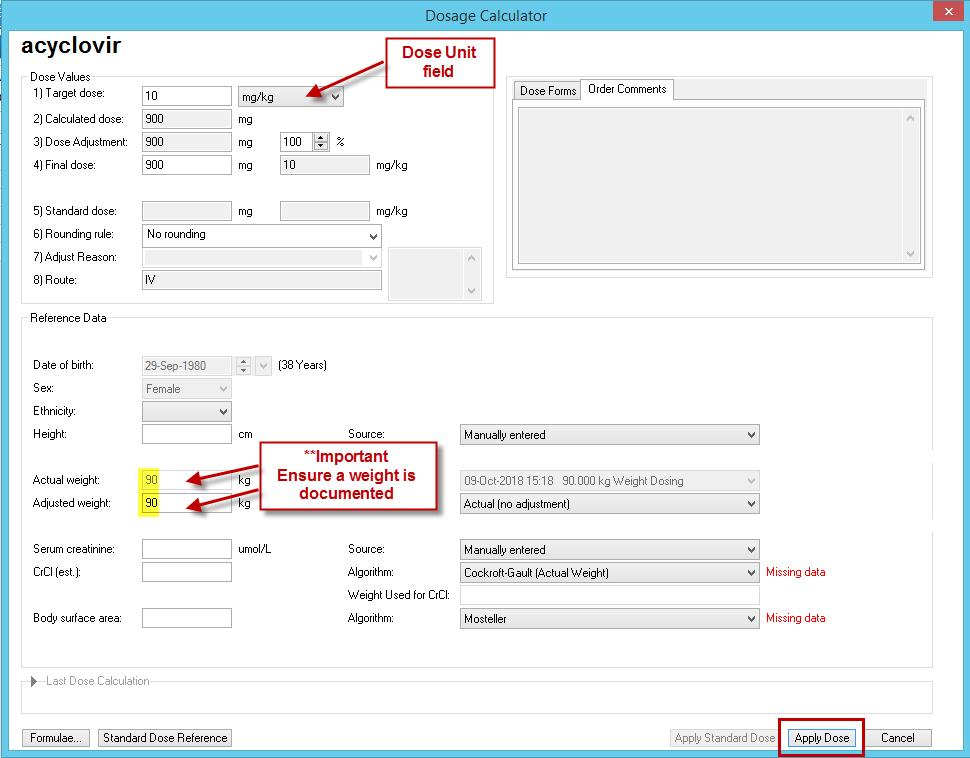
The legacy screens presented values as long, undifferentiated lists. The redesign follows the order clinicians reason in, and keeps the final dose unmistakable.
07 · Outcome and evidence
Evaluated through customer feedback and usability assessments. The Software Usability Score is a composite mean across accessibility, satisfaction, patient safety, usability & design, and modernization (effectiveness).
Evidence
6.3 → 8.9
Software Usability Score (composite mean)
Evidence
+2.6
Point improvement
Evidence
5
Dimensions, including patient safety
Evidence
3
Clinical roles served
08 · Leadership takeaway
“Complexity is inherent to healthcare. Poor usability doesn’t have to be.”